Android Lists and Cards

Source

Create Lists

RecyclerView 是比 ListView 更進階和彈性的版本。

它是為了呈現 large data sets 的容器(container),且藉由維護有限數量的 views 讓滾動更有效率。

Use the RecyclerView widget when you have data collections whose elements change at runtime based on user action or network events.

RecyclerView 提供了:

  • layout manager(定位item)
  • 預設 animation,(如 add / remove item)

Swift 2.0

Adapter

要使用 RecyclerView 的話,你必須指令 adapter(繼承 RecyclerView.Adapter) 和 layout manager。

Layout Manager

layout manager 會把 view 定位在 RecyclerView 裡,且決定何時 reuse / recycle views

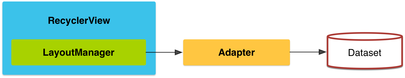
a layout manager may ask the adapter to replace the contents of the view with a different element from the dataset.

Recycling views in this manner improves performance by avoiding the creation of unnecessary views or performing expensive findViewById() lookups.

內建的 layout manager:

  • LinearLayoutManager
  • GridLayoutManager
  • StaggeredGridLayoutManager
  • custom(extends RecyclerView.LayoutManager)

Animations

extends RecyclerView.ItemAnimator

RecyclerView.setItemAnimator() method.


Example

RecyclerView layout
1
2
3
4
5
6
<!-- A RecyclerView with some commonly used attributes -->
<android.support.v7.widget.RecyclerView
android:id="@+id/my_recycler_view"
android:scrollbars="vertical"
android:layout_width="match_parent"
android:layout_height="match_parent"/>

RecyclerView Code
1
2
3
4
5
6
7
8
9
10
11
12
13
14
15
16
17
18
19
20
21
22
23
24
25
public class MyActivity extends Activity {
private RecyclerView mRecyclerView;
private RecyclerView.Adapter mAdapter;
private RecyclerView.LayoutManager mLayoutManager;

@Override
protected void onCreate(Bundle savedInstanceState) {
super.onCreate(savedInstanceState);
setContentView(R.layout.my_activity);
mRecyclerView = (RecyclerView) findViewById(R.id.my_recycler_view);

// use this setting to improve performance if you know that changes
// in content do not change the layout size of the RecyclerView
mRecyclerView.setHasFixedSize(true);

// use a linear layout manager
mLayoutManager = new LinearLayoutManager(this);
mRecyclerView.setLayoutManager(mLayoutManager);

// specify an adapter (see also next example)
mAdapter = new MyAdapter(myDataset);
mRecyclerView.setAdapter(mAdapter);
}
...
}
Adapter Code
1
2
3
4
5
6
7
8
9
10
11
12
13
14
15
16
17
18
19
20
21
22
23
24
25
26
27
28
29
30
31
32
33
34
35
36
37
38
39
40
41
42
43
44
45
46
47
public class MyAdapter extends RecyclerView.Adapter<MyAdapter.ViewHolder> {
private String[] mDataset;

// Provide a reference to the views for each data item
// Complex data items may need more than one view per item, and
// you provide access to all the views for a data item in a view holder
public static class ViewHolder extends RecyclerView.ViewHolder {
// each data item is just a string in this case
public TextView mTextView;
public ViewHolder(TextView v) {
super(v);
mTextView = v;
}
}

// Provide a suitable constructor (depends on the kind of dataset)
public MyAdapter(String[] myDataset) {
mDataset = myDataset;
}

// Create new views (invoked by the layout manager)
@Override
public MyAdapter.ViewHolder onCreateViewHolder(ViewGroup parent, int viewType) {
// create a new view
View v = LayoutInflater.from(parent.getContext())
.inflate(R.layout.my_text_view, parent, false);
// set the view's size, margins, paddings and layout parameters
...
ViewHolder vh = new ViewHolder(v);
return vh;
}

// Replace the contents of a view (invoked by the layout manager)
@Override
public void onBindViewHolder(ViewHolder holder, int position) {
// - get element from your dataset at this position
// - replace the contents of the view with that element
holder.mTextView.setText(mDataset[position]);

}

// Return the size of your dataset (invoked by the layout manager)
@Override
public int getItemCount() {
return mDataset.length;
}
}
Dependency
1
2
3
dependencies {
compile 'com.android.support:recyclerview-v7:21.0.+'
}

Card

待補

Defining Shadows and Clipping Views

Assign Elevation to Your Views

The Z value for a view has two components:

Elevation: The static component.
Translation: The dynamic component used for animations.
Z = elevation + translationZ

Customize View Shadows and Outlines

1
2
3
4
5
<TextView
android:id="@+id/myview"
...
android:elevation="2dp"
android:background="@drawable/myrect" />
1
2
3
4
5
6
<!-- res/drawable/myrect.xml -->
<shape xmlns:android="http://schemas.android.com/apk/res/android"
android:shape="rectangle">
<solid android:color="#42000000" />
<corners android:radius="5dp" />
</shape>

自訂 outline

1.Extend the ViewOutlineProvider class.
2.Override the getOutline() method.
3.Assign the new outline provider to your view with the View.setOutlineProvider() method.

Clip Views

Clipping views 能讓你簡單地改變 view 的形狀。

views for consistency with other design elements or to change the shape of a view in response to user input.

You can clip a view to its outline area using the View.setClipToOutline() method or the android:clipToOutline attribute.

Only rectangle, circle, and round rectangle outlines support clipping, as determined by the Outline.canClip() method.

To clip a view to the shape of a drawable, set the drawable as the background of the view (as shown above) and call the View.setClipToOutline() method.

Clipping views is an expensive operation, so don’t animate the shape you use to clip a view. To achieve this effect, use the Reveal Effect animation.

Styles

1
2
3
4
5
6
7
8
9
10
11
12
13
14
15
16
17
18
19
20
<TextView
android:layout_width="fill_parent"
android:layout_height="wrap_content"
android:textColor="#00FF00"
android:typeface="monospace"
android:text="@string/hello" />


<TextView
style="@style/CodeFont"
android:text="@string/hello" />


<?xml version="1.0" encoding="utf-8"?>
<resources>
<style name="CodeFont" parent="@android:style/TextAppearance.Medium">
<item name="android:layout_width">fill_parent</item>
<item name="android:layout_height">wrap_content</item>
<item name="android:textColor">#00FF00</item>
<item name="android:typeface">monospace</item>
</style>

</resources>

design Lib

TabLayout

1
2
3
4
5
6
<android.support.design.widget.TabLayout
android:id="@+id/sliding_tabs"
android:layout_width="match_parent"
android:layout_height="wrap_content"
app:tabMode="fixed"
app:tabGravity="fill" />

tabMode : fixed | scrollable
tabGravity : fill | centre
setText()
setIcon()

App Bar

app:layout_scrollFlags : enterAlways | enterAlwaysCollapsed | exitUntilCollapsed

1
2
3
4
5
6
7
8
9
10
11
12
13
14
15
16
17
18
19
20
21
22
23
24
25
<android.support.design.widget.CoordinatorLayout
xmlns:android="http://schemas.android.com/apk/res/android"
xmlns:app="http://schemas.android.com/apk/res-auto"
android:layout_width="match_parent"
android:layout_height="match_parent">

<android.support.v7.widget.RecyclerView
android:layout_width="match_parent"
android:layout_height="match_parent"
app:layout_behavior=
"@string/appbar_scrolling_view_behavior" />

<android.support.design.widget.AppBarLayout
android:layout_width="match_parent"
android:layout_height="wrap_content">

<android.support.v7.widget.Toolbar
...
app:layout_scrollFlags="scroll|enterAlways" />

<android.support.design.widget.TabLayout
...
/>
</android.support.design.widget.AppBarLayout>
</android.support.design.widget.CoordinatorLayout>

ToolBars

app:layout_collapseMode : Pin | Parallax